Designing with less.

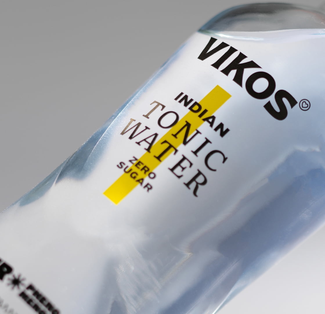
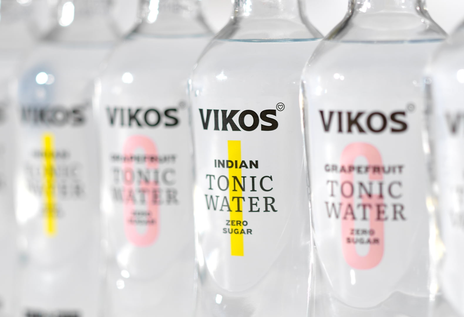
In a category defined by excess, Vikos Tonic Zero takes a different path. Tonic water packaging is often built on layers – information, decoration, brand signals – all competing for attention. The result is a visual landscape that feels crowded and predictable. With Vikos Tonic Zero, we explored the opposite approach: what happens when you remove everything that isn’t essential.
The concept was simple. “Zero” is not just a product claim. It is a design principle. The transparent liquid becomes the hero. Instead of hiding it behind graphics, the design allows it to speak. The bottle acts as a clean frame, letting the product define its own presence. Typography takes on a structural role. It doesn’t decorate, it organizes. Information is reduced to its core and arranged with clarity and rhythm, creating a calm, balanced composition. Color is used with precision. Subtle vertical accents differentiate each variant without disturbing the overall purity of the system. Just enough to guide, never to overwhelm. The existing Vikos glass bottle remains untouched, reinforcing continuity and allowing the new range to integrate seamlessly within the brand’s ecosystem.


The result is a packaging system that doesn’t try to stand out by being louder but by being quieter. A design that proves that, sometimes, less is not only more. It is everything.

Loading...