A refreshed brand on the way to the top.
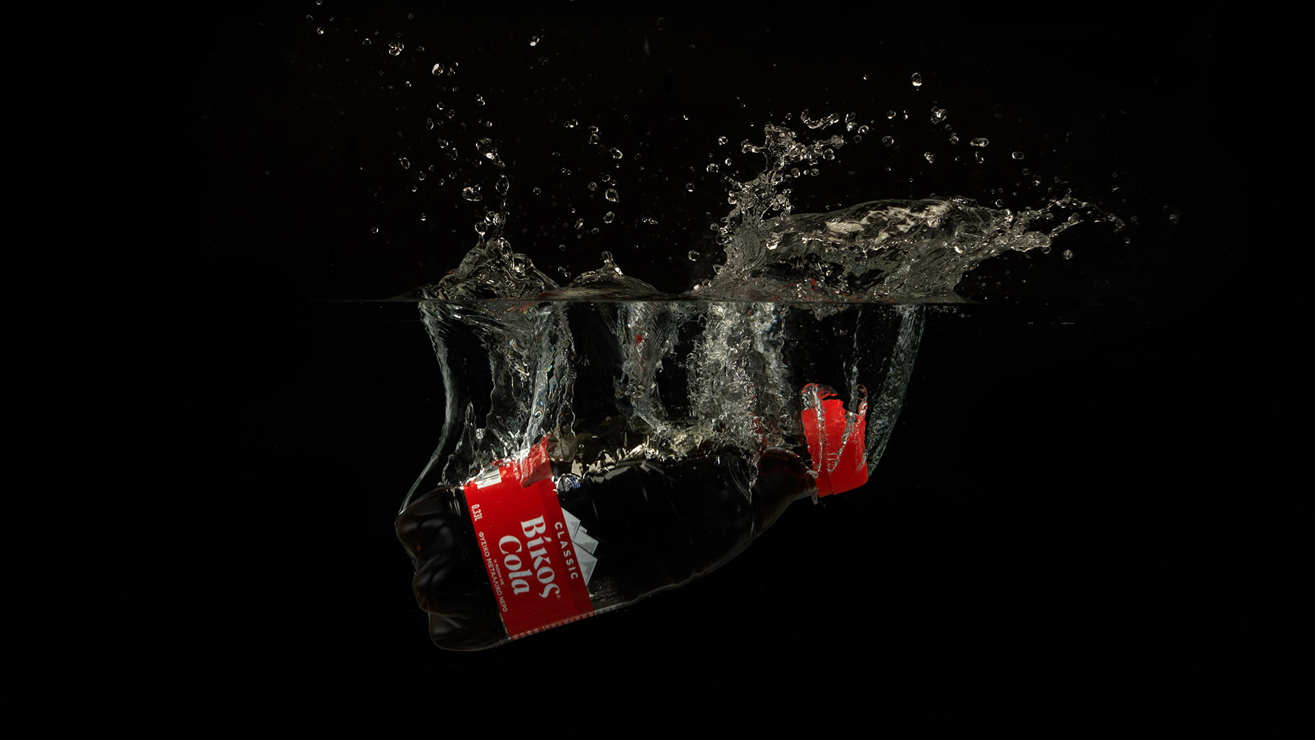
Vikos Cola is truly a Greek success story: it is the 2nd best-selling brand in Greece, second only to the largest international cola brand. It is also the only cola made with natural mineral water, and shares its name with the same company’s famous natural mineral water brand. This is the product’s USP, and an element that the rebranding exercise needed to promote.
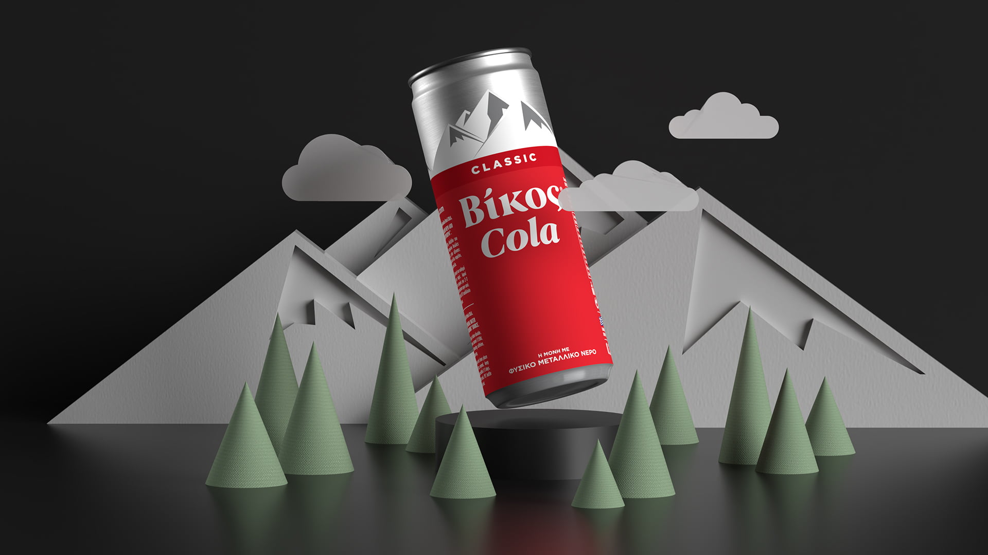
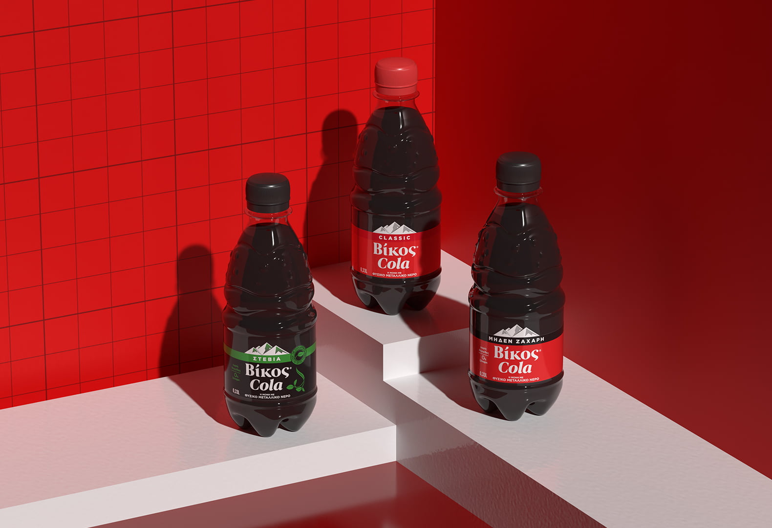
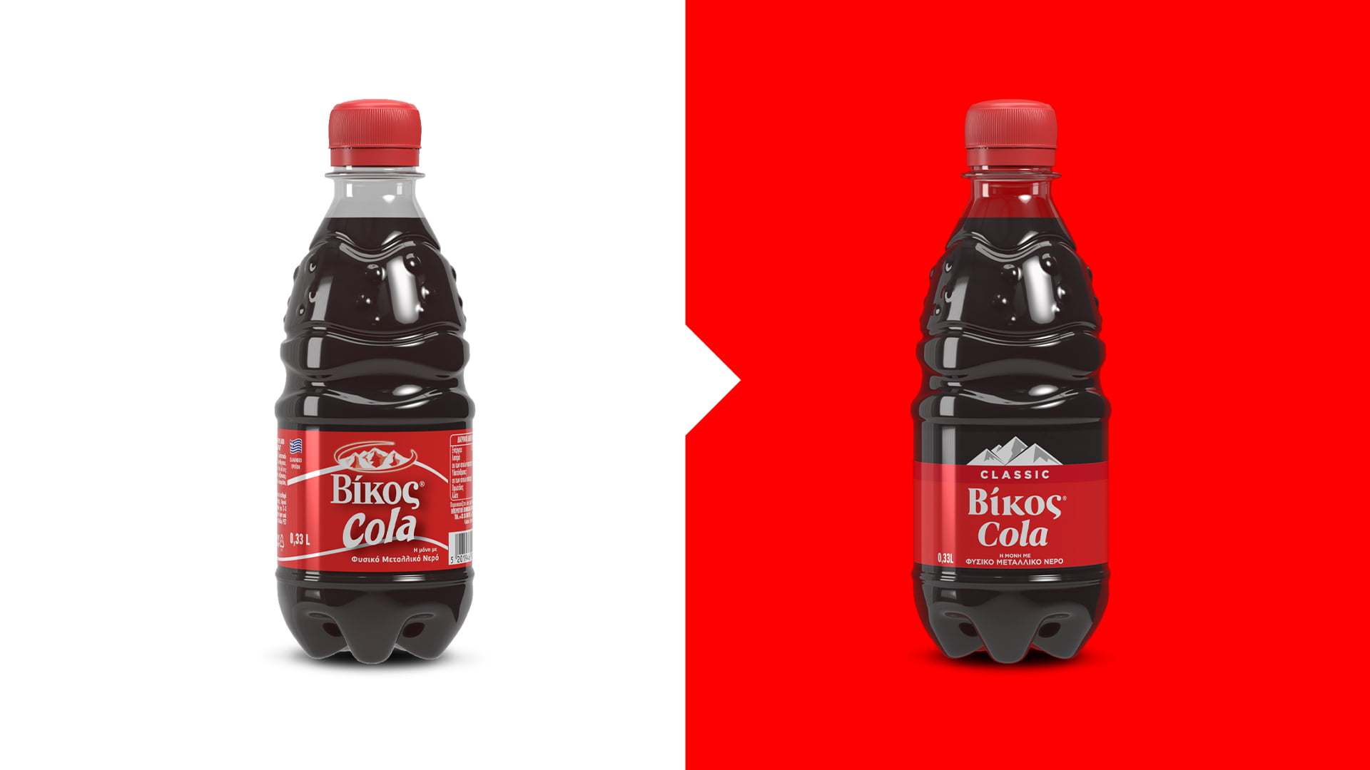
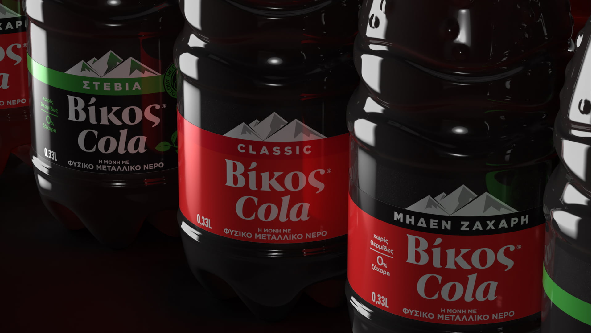
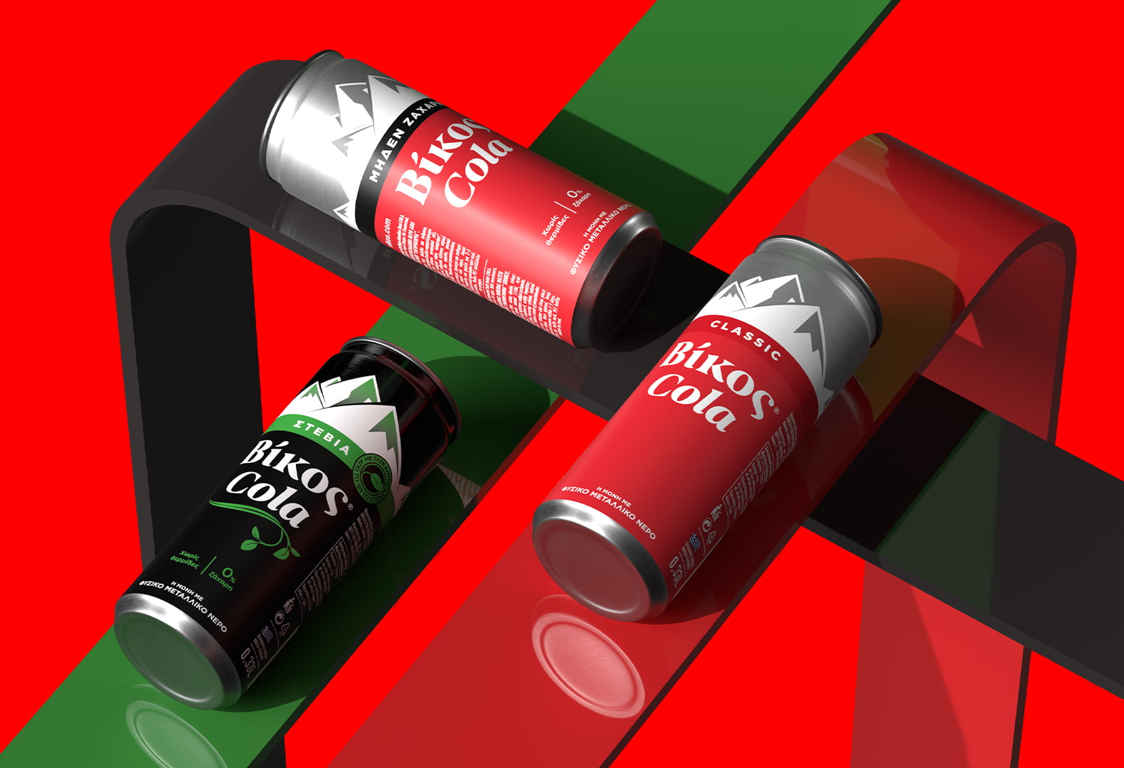
Our rebranding strategy involved creating a dynamic brand block and designing an architecture that will facilitate adding multiple variants to the brand portfolio in future. This led us to simplify the packaging’s design elements, and divide it into three parts. For the upper part, we chose to reintroduce the brand’s trademark: the snow-covered mountain range overlooking the Vikos gorge. Mountaintops, an international symbol among natural mineral water brands, are now the key design element of the packaging, and what links Vikos Cola to its DNA.
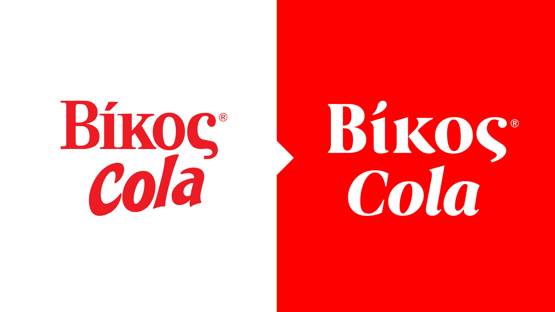
The Vikos Cola logo was redesigned for a cleaner, more robust look, with a serif typeface to maintain links to the old logo. However, the lettering is curvier and smoother, the words are equally sized, and the shadowing has been removed.
Another challenging task for the rebranding was to design a new original glass bottle, in collaboration with Oxymoro design team. The result was a bottle characterized by the “femininity” of water – its plasticity and harmony. Rhythmic water ripples and the complementary curves of the ying-yang symbol are the distinctive elements of the design.
Τhe rebranding of Vikos Cola highlights the freshness and uniqueness of its tasteful character, and marks the company’s dynamic course in the field of soft-drinks, in which it has gained a remarkable market share in a very short period of time. At the same time, it illustrates the overall development of Vikos, in the context of its strategy which involves continuous investments, modernization and the presentation of new products that are immediately loved by consumers.
Loading...
