Building a brand that represents the best the Greek earth has to offer.
The Grecials is an initiative by a major Greek agricultural cooperative to collect top food products from small producers throughout Greece and place them on shelves around the globe and Greece. Respect for the Greek earth and tradition is at the very heart of the brand. It is the labour of love of artisans who cultivate their land ethically, ensuring sustainability and high biodiversity.
The Grecials is a mashup brand name from the words Greek and Specials. On the one hand, it signifies the Greek origin of the products to the international market, while on the other characterizing a brand that aims to promote the specialties; the signature products of each area of Greece.

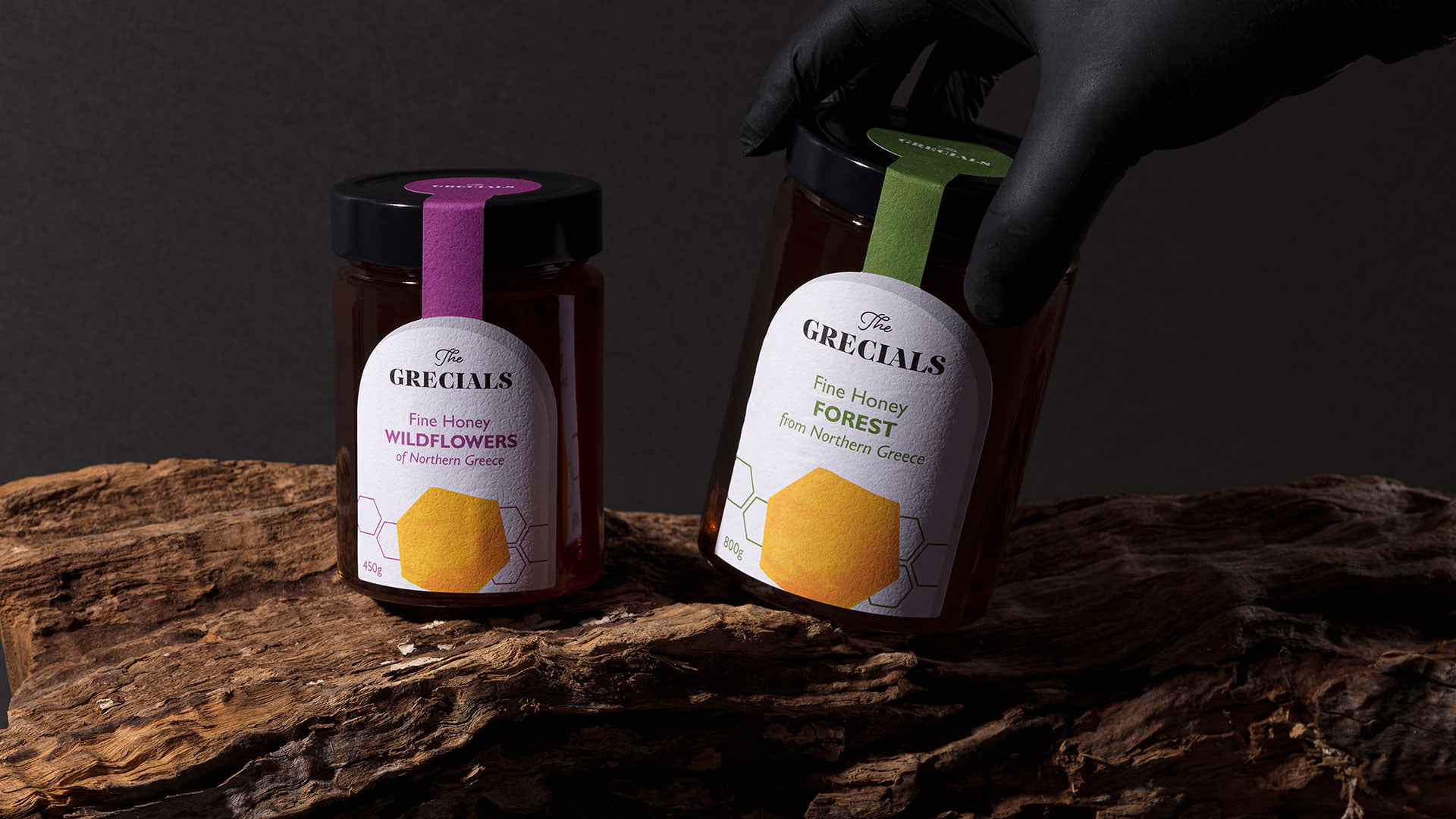
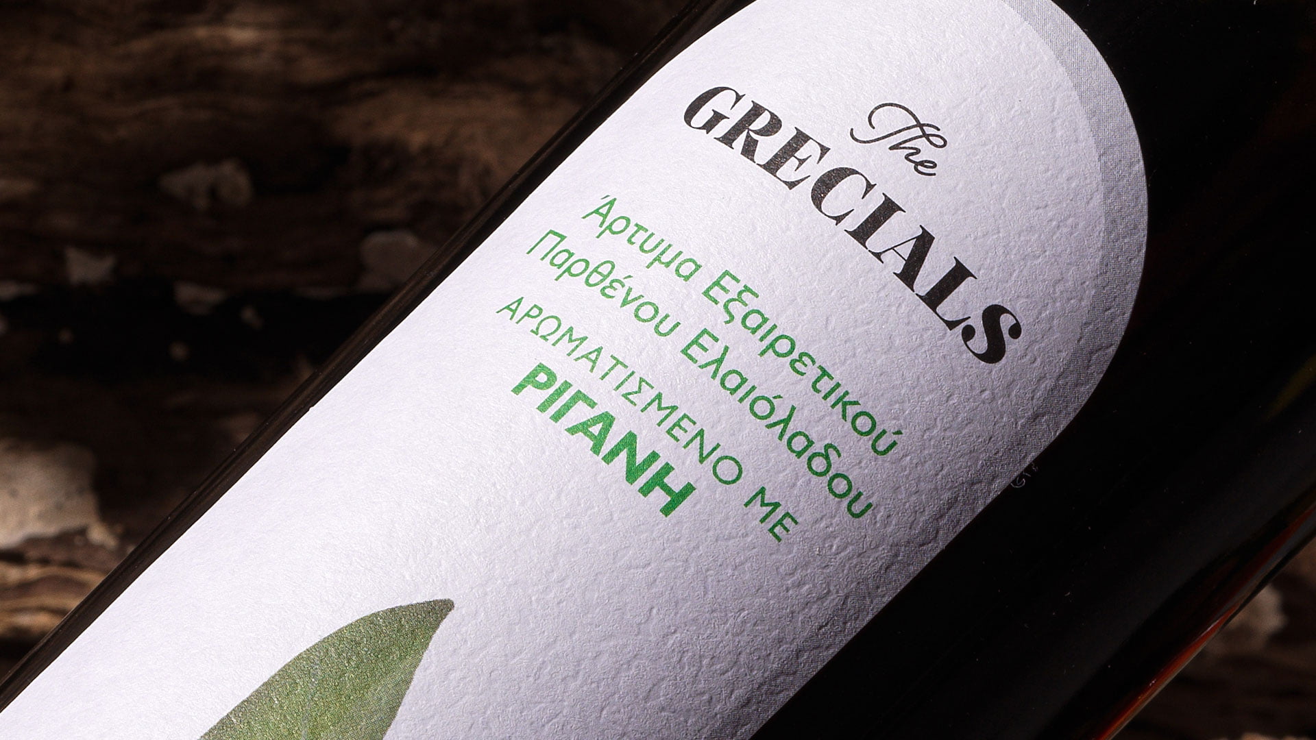
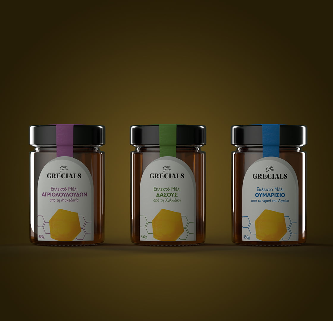
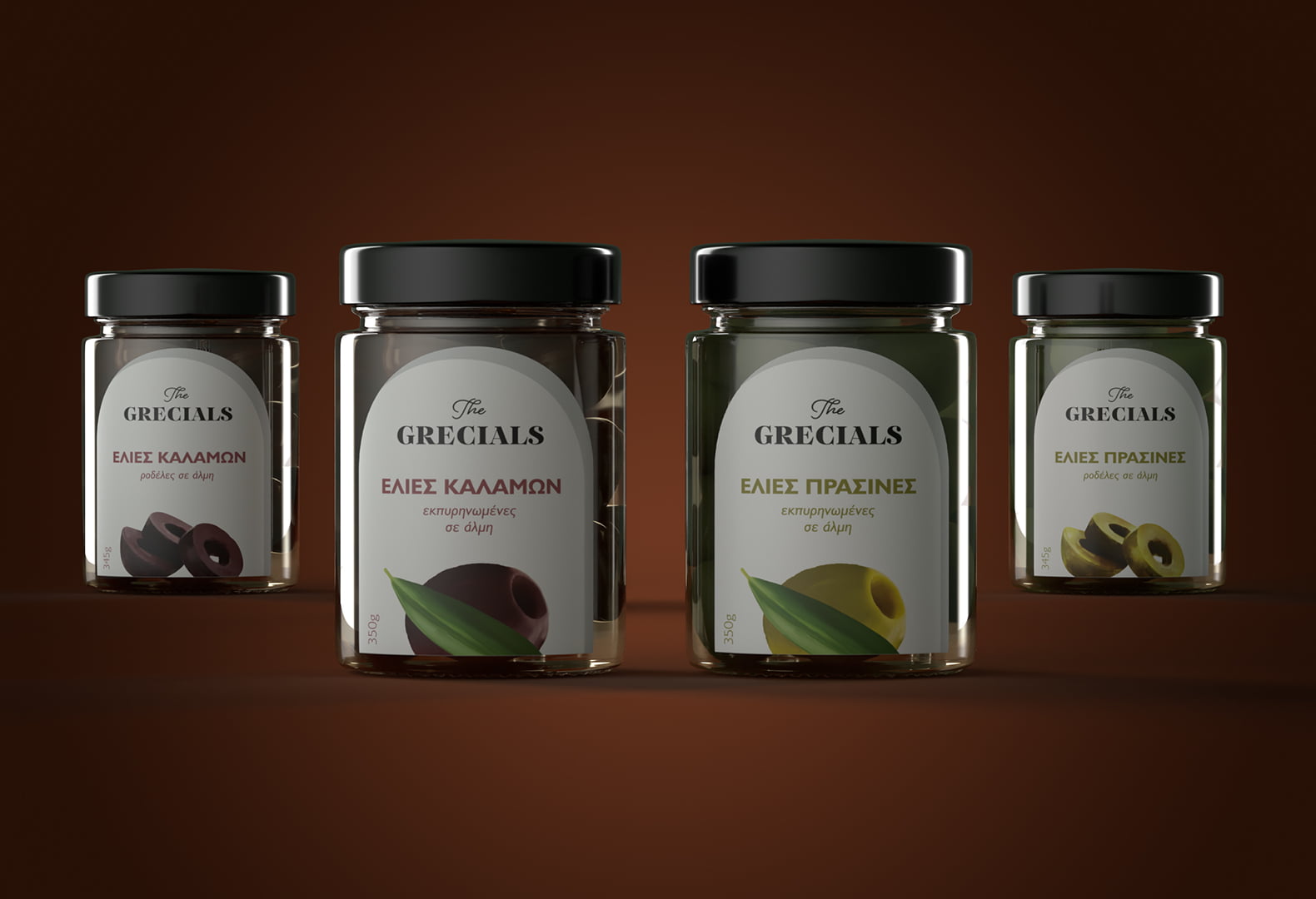
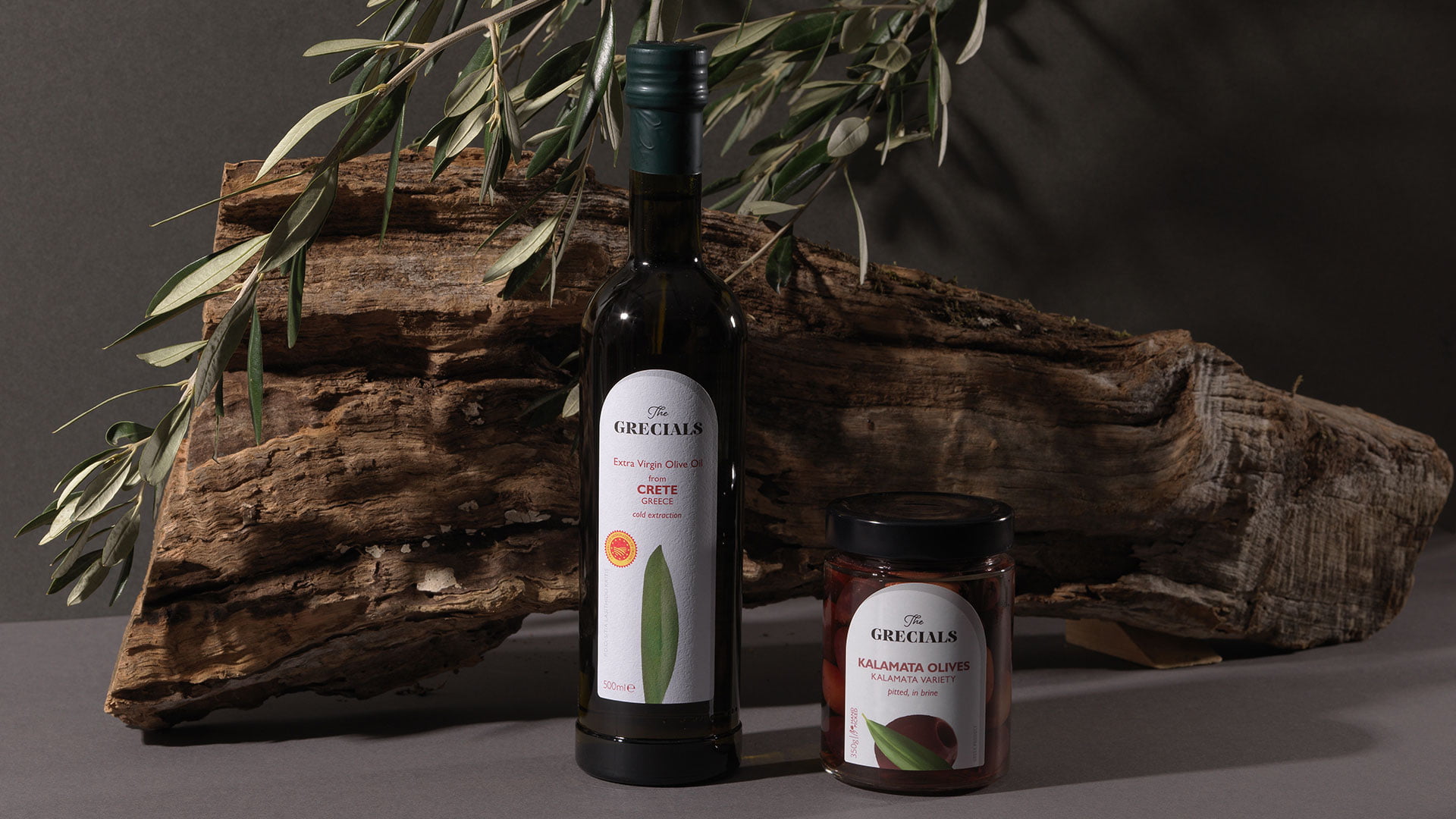
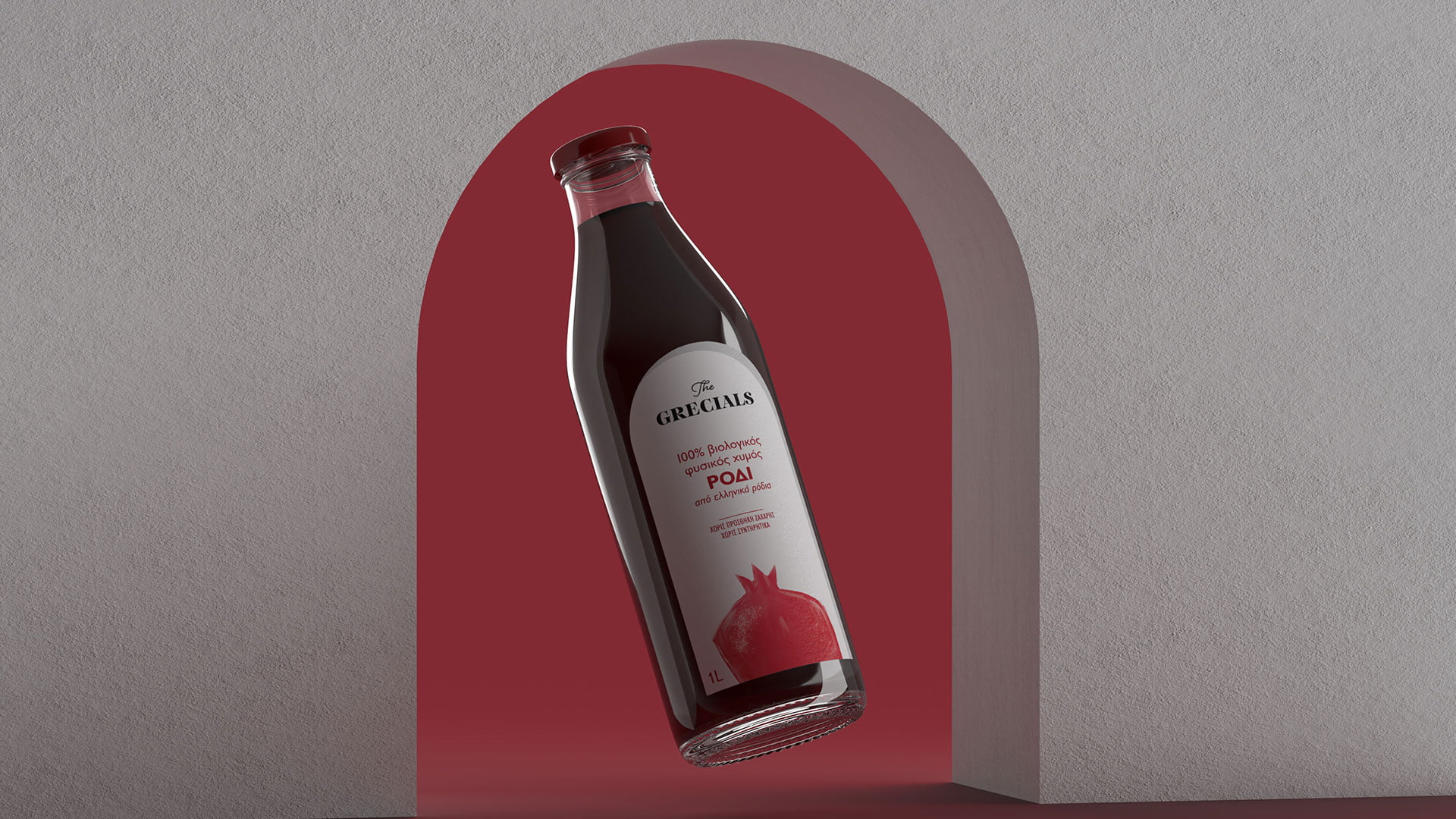
The design brief required a flexible house style applicable to many categories of products, and several variants within each category. At the same time, we sought an international visual code for ‘greekness’: a white arch, a dominant architectural element in Greece, and particularly in the Aegean islands. The arch is accompanied by a shadow, signifying the blinding light of Greek summer.
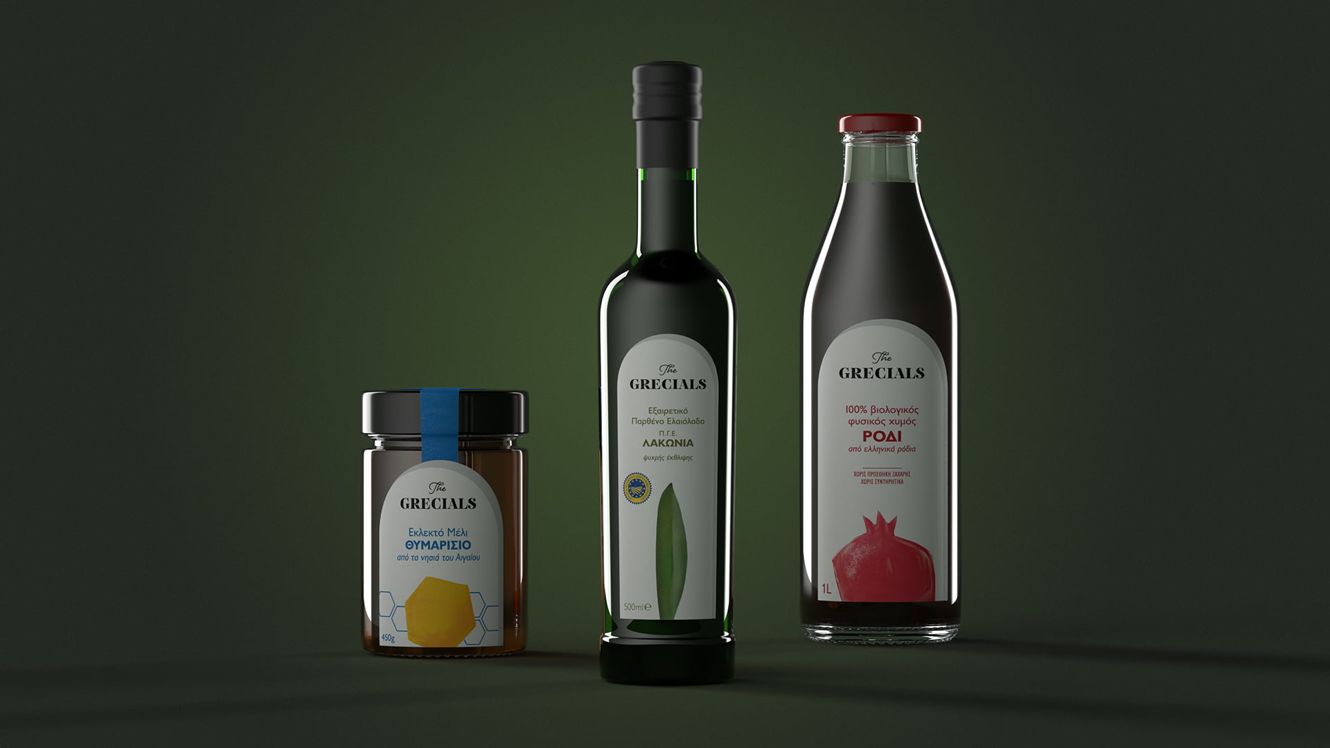
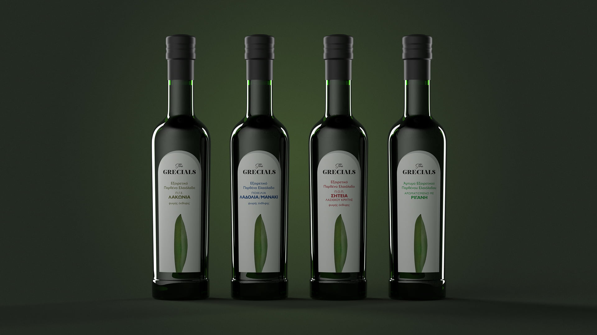
Each product is distinguished by a stylized natural element; an olive leaf, a beehive, a pomegranate. The typography is Doric, with colour-coding for variants within each product family.
Loading...