How to avoid a me-too on the crowded path of Greekness.
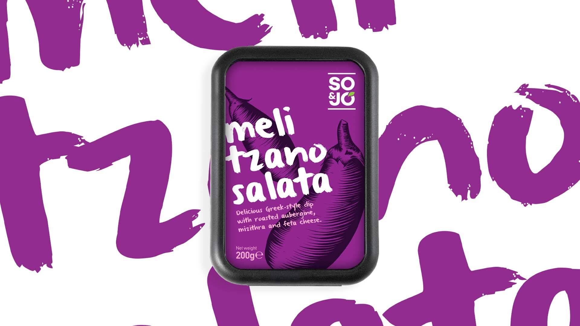
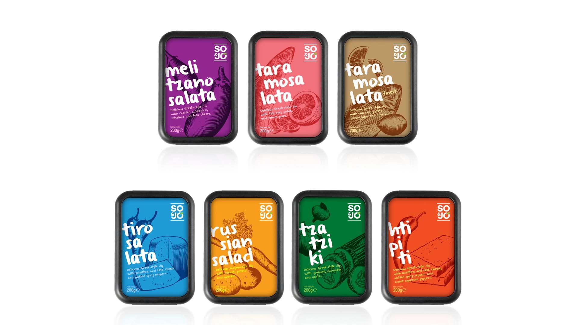
So & Jo is a fresh take on the traditional Greek dips, one of the most popular foodvenirs for those who visit Greece. The branding of yet another Greek product that claims a spot at the international market is always a bet.


We explored the codes of Greekness with a pop attitude and humour. The brand name So & Jo resulted from the names of the creators of the 3P food industry, with the intention to create a brand story about a duo of friends who raids our fridge for a quick treat. We designed the packaging choosing a series of bright colours, discrete engravings of the main ingredients of each recipe and a vivid typography on the original Greek names of the recipes, winking at the international cliché “it’s all Greek to me”.
Loading...