When kids talk, brands listen. A rebranding motivated by the fact that kids grow faster than we think.

Pharmasept is a leading Greek company at the pharmacy shelf, thanks to its extensive portfolio of high-quality personal care products. Having a best-seller in its range of infant hygiene and care products, the brand wishes to maintain its fan-base among the mothers of older children. Although Pharmasept Kids Line had effortlessly earned the trust of mothers, it failed to meet with children’s approval, as it was perceived as too “childish”. Today’s kids quickly get over the symbols of childhood, while it‘s obvious that everything around them (technology, SoMe) is pushing them towards puberty earlier than past generations.


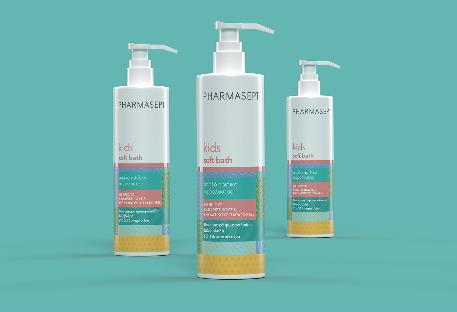
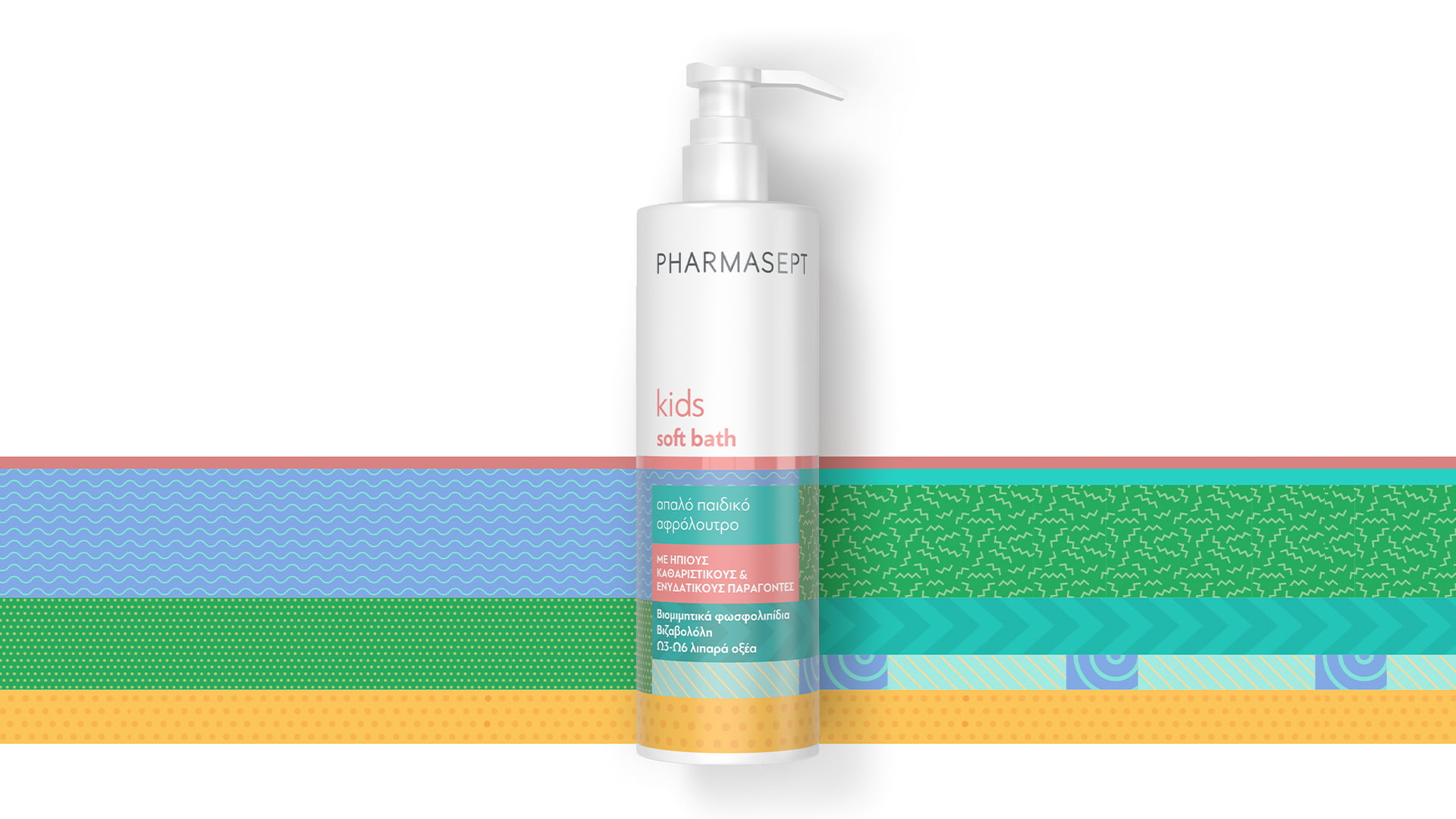
The new packaging of the kids line does not lack youthfulness or fun. Those feelings were though translated into color, motion and a pinch of pop mood. We were inspired by the Memphis Group design movement of the ‘80s, and we made the most of color blocking and layering. While the dominant blue/purple hues were selected as a link to the brand’s successful infant range.


The rebranding of Pharmasept kids products was certainly a boost for the brand, as in the first semester after the launch, there was a remarkable 25% increase in sales.
Loading...