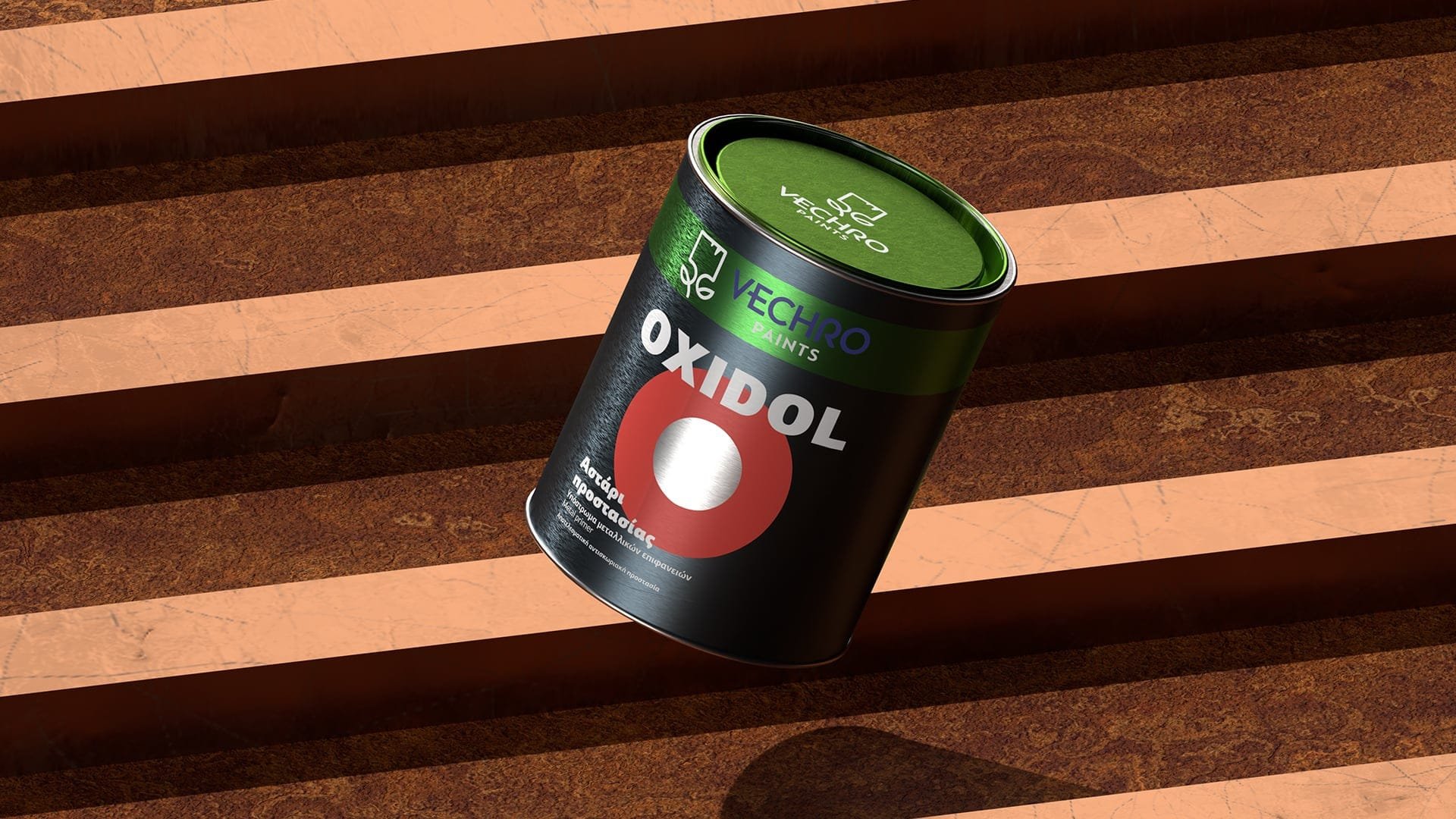
One solid rebranding in Vechro’s extensive portfolio makeover.
Vechro’s corporate identity rebranding led to the redesign of all brands in the company’s portfolio. The Oxidol range of primers and paints for metal surfaces was no exception.
The new Oxidol packaging had to incorporate the new Vechro ΙD, but also to blend seamlessly into the company’s brand architecture. That meant keeping the visual cues that unify the Vechro brand, but also having a separate design element that would set Oxidol apart, while also being versatile enough to serve all variants in the range.
The new design was based on concentric circles that hint of the way in which the paints protect metal surfaces; metal erosion progresses from the outer to the inner layers. The design facilitated colour-coding among variants, with a playful effect between the painted and unpainted surfaces of the tinplate cans.
Loading...


