Shaping a future-ready brand identity.
FOURLIS GROUP, a leader in quality consumer durable goods, embarked on redefining its brand identity to reflect its core values and future vision. In collaboration with The Newtons Laboratory, we led this ambitious project, crafting a holistic approach to rebranding, spanning across multiple facets of strategy and design.
At the heart of the rebranding effort was crafting a compelling brand story that resonates with FOURLIS GROUP’s stakeholders—customers, employees, and partners—highlighting its growth journey, sustainability commitment, and future outlook. Central to this process was the creation of a new logotype and visual identity for FOURLIS GROUP that would be both modern and timeless, capturing the essence of FOURLIS GROUP’s legacy and its forward-thinking approach. The new logo features clean lines and a bold, confident, and friendly typeface, symbolizing a stable, confident group of companies with a human-centric approach.
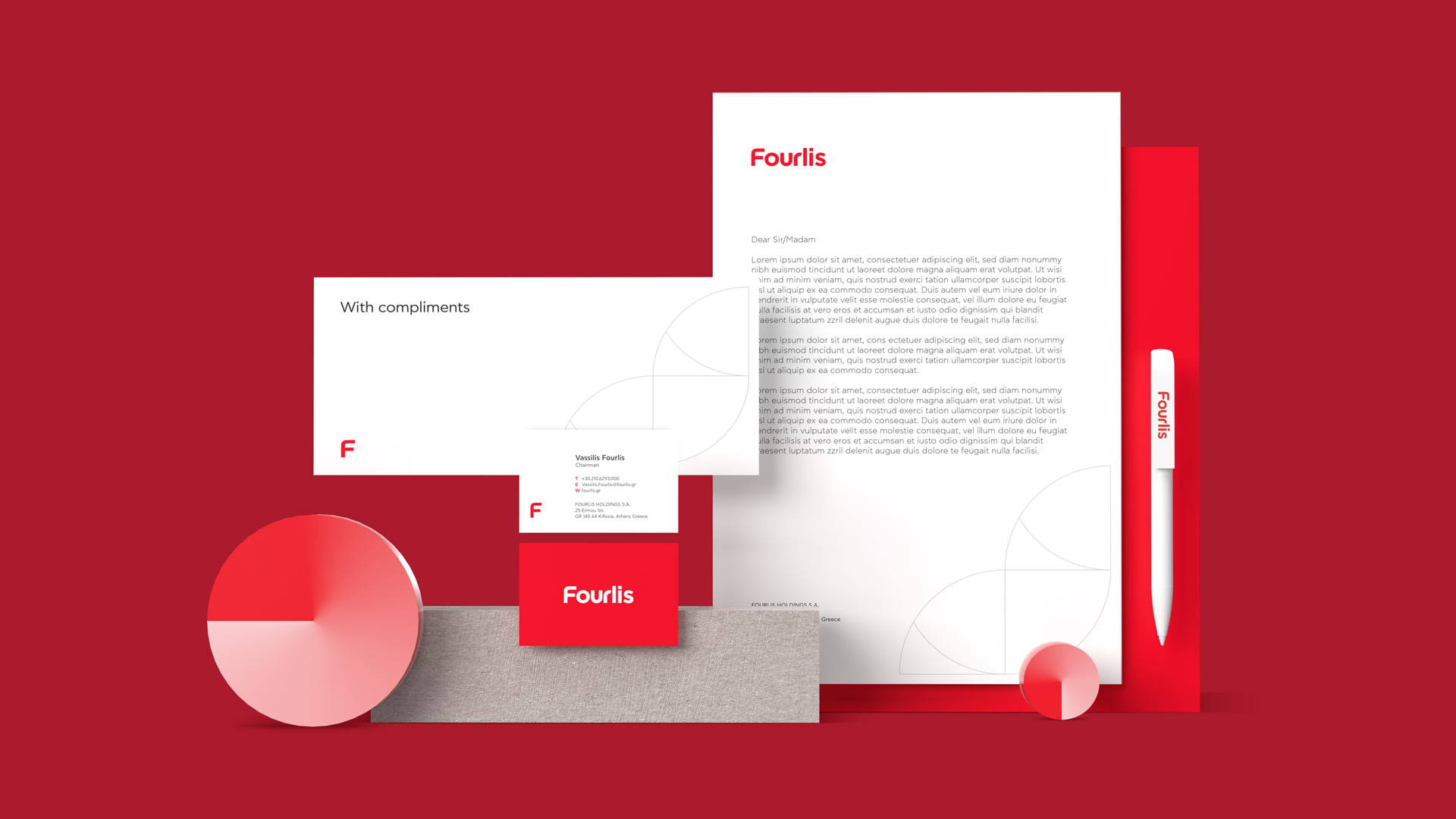
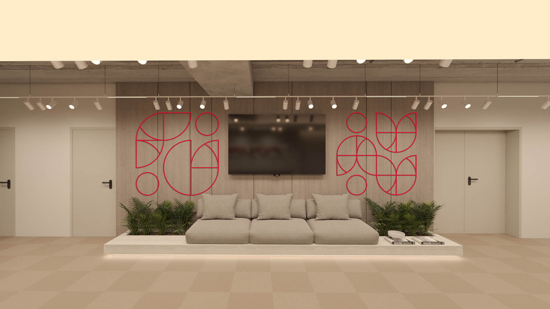
The red color remained the primary color, respecting the group’s legacy and its ever-evolving personality. The brand house style is designed to be versatile, ensuring that it can be effectively utilized in both digital and physical spaces, from websites and social media to store signage and marketing materials.

To maintain consistency, we developed a comprehensive brand manual covering logo usage, color palettes, brand tone of voice, visual language, and art direction for photography usage, as well as design guidelines for all types of communication materials. This ensures unified and professional communication aligned with FOURLIS GROUP’s values and strategic goals, both internally and externally.


Loading...