Turning local to low cal! A brand extension that worked well.
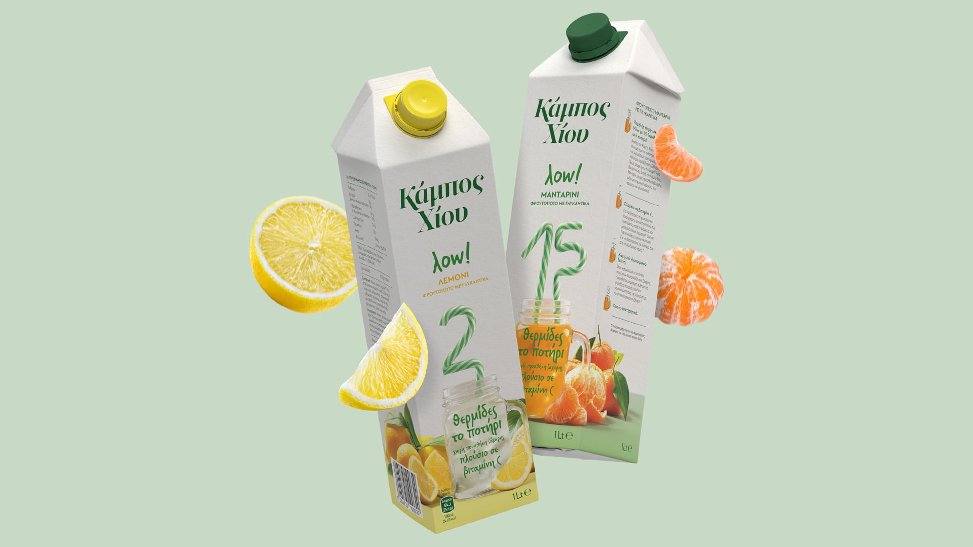
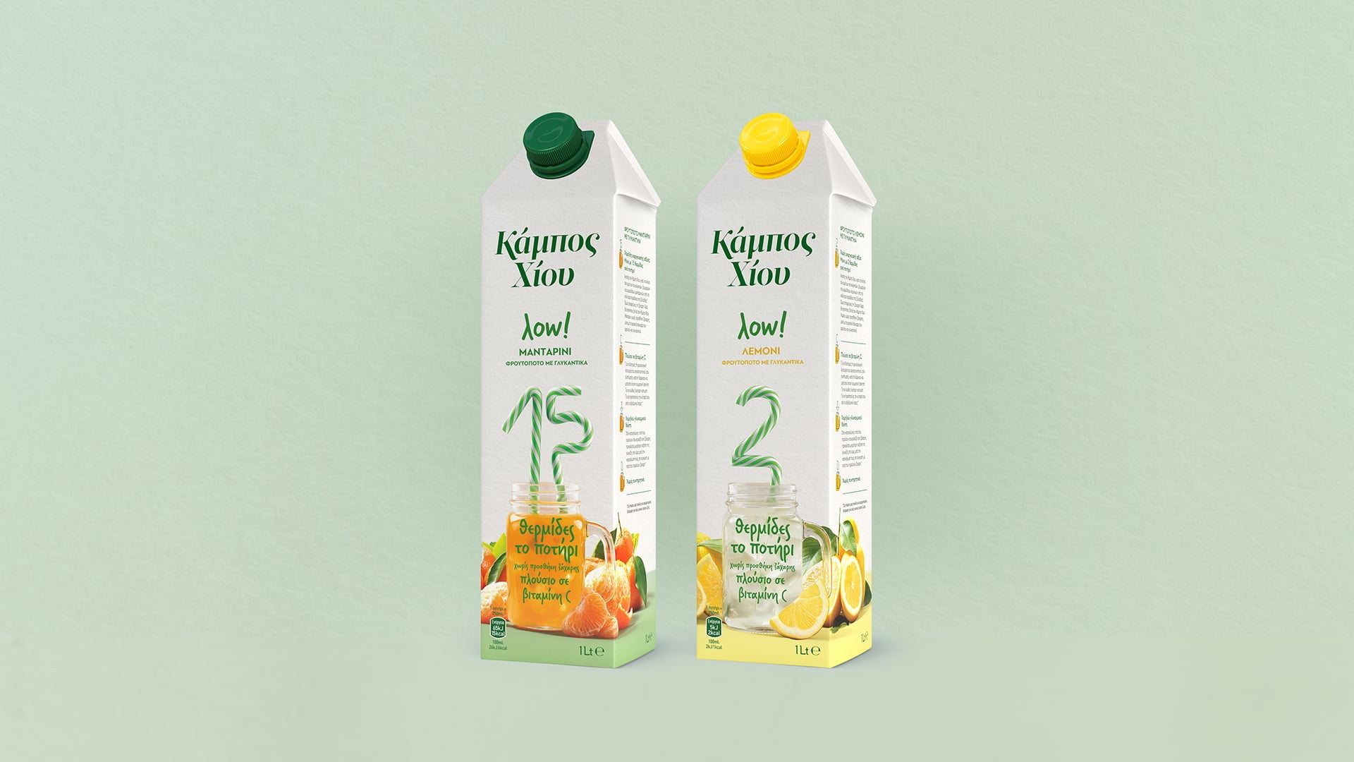
For the branding of the first low-calorie fruit drink by Chios Gardens, the challenge was to balance the traditional visual cues for fruit juices, with educating consumers about a fresh new category that is lighter than they could even imagine. The packaging had to take into account the competitors that will soon appear in shops, and avoid any clichés. The new line would also need to provide a harmonious complement to the Chios Gardens brand architecture, and stand out from existing product ranges at a single glance.

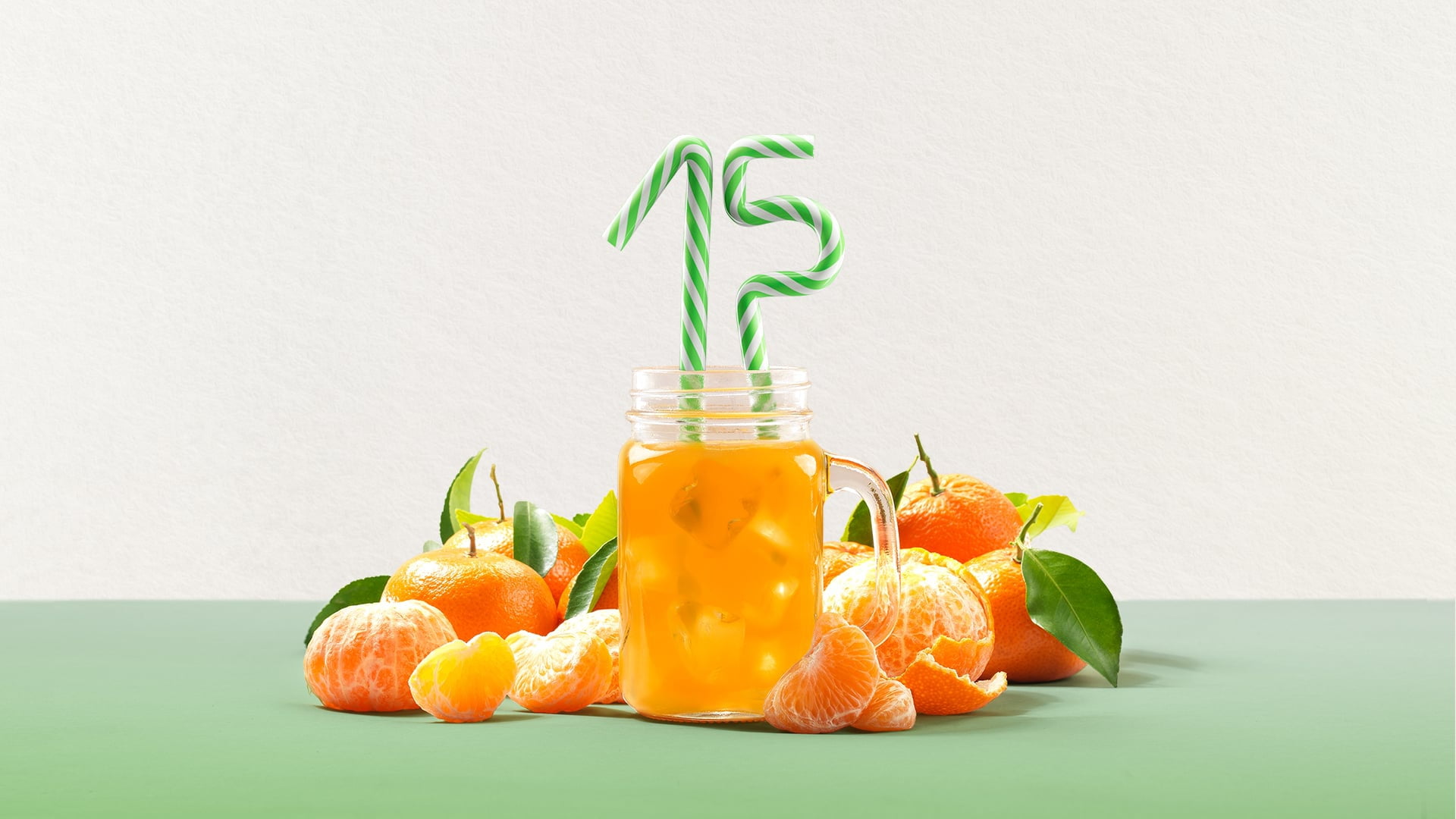


The truly low number of calories in each glass of Chios Gardens λow turn up in pop visuals that enhance the traditionally dull role played by calorie content information. White was selected as the best colour for the light and functional products in the FMCG category, and because it creates a strong colour block for the new brand on the colourful fruit juice shelf.
Loading...