Nostalgia revisited for one of the biggest Greek love brands.
Vitam is not just another brand of margarine; it is one of the biggest Greek love brands. It has been a synonym of a flavoursome, nutritious diet for the whole family, for over 70 years. Today, Vitam continues to lead the market in the margarine and butter segment, with multiple best-selling variants.
As is true for all leaders, the brand has had to deal with two major challenges over time: dealing with copycat brands on the market; and remaining fresh and relevant to the new generation of consumers. In recent years, Vitam had started to look similar to its lower-quality competitors, failing to convey the reliability of a top-quality margarine with a totally natural composition. Thus, premiumness and naturalness cues were the main requisites of the rebranding challenge.


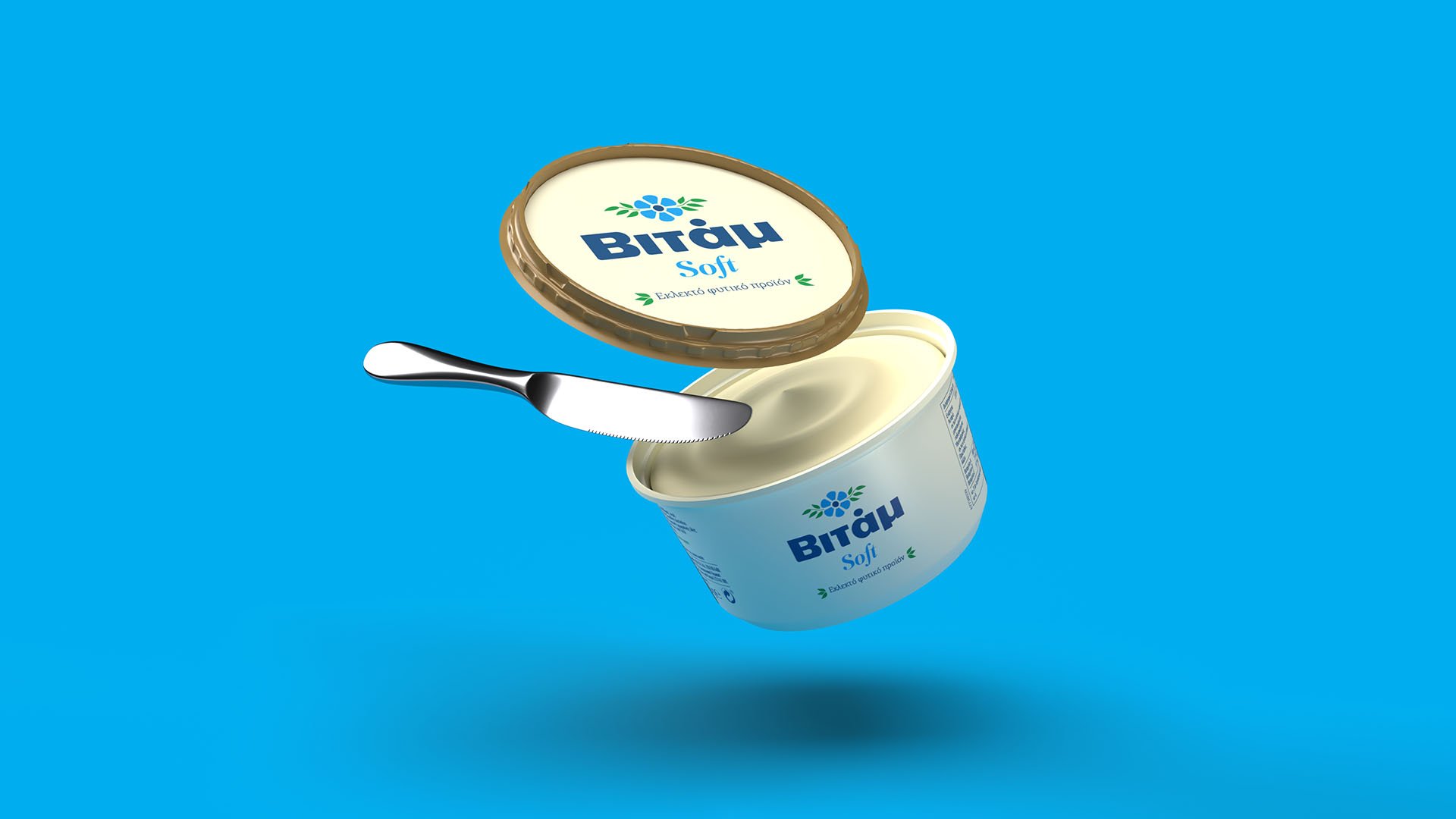
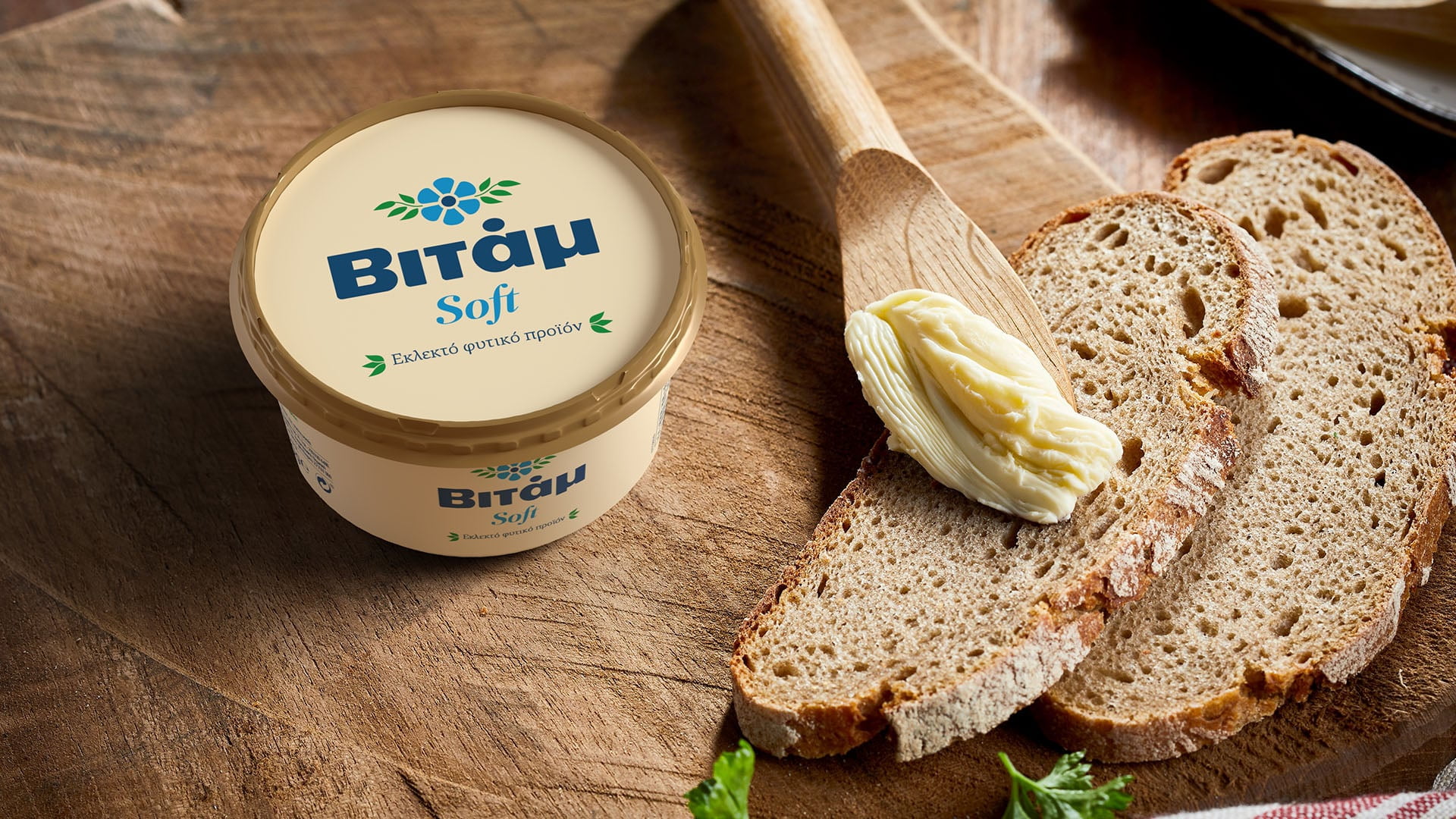
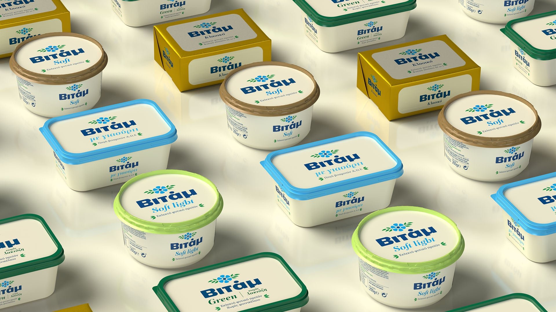
Simplicity in Vitam’s new image, was the key response to that challenge. The range’s star variant, Vitam Soft, traded the colour yellow for a nostalgic beige, drawing inspiration from one of the brand’s older, iconic tubs. This colour brought together all of the Vitam range’s variants. At the same time, a major role in the rebranding was played by a well-balanced facelift to the logo, which was based on a simplified, but still familiarly chunky typography.
Vitam’s new era is built on a brand that is sure of itself, moving forward by investing in its rich history. It is always a creative challenge for a love brand to modernise precisely those elements that invoke familiarity and nostalgia.
Loading...